Wednesday, 18 December 2013

Photograms

Photograms

photogram is a image created without a camera. It is done by by placing objects directly onto the surface of a light-sensitive material (such as photographic paper) and then exposing it to light. The areas of the paper that have received no light (where the objects have been) appear white and the ones which have been exposed to light appear grey/black once it has been through the developer (1 min), stop bath (1 min), fixer bath (1min), left in water to wash (2 mins) and then left to dry.
Here are my photograms which I made, which are in my sketch book. One of them are bleached which gives it the brown/yellow hint. 
I enjoyed working in the dark room and would like to do it again. 

Narrative Photography: Research and digital story board

Narrative Photography
Narrative photography is the idea that photographs can be used to tell a story.

PHOTOGRAPHER RESEARCH
I used the internet for my research sources. This is secondary research.

Duane Michals
Duane Michals is an American photographer who uses narrative photography. In his work of photo sequences he often adds texts to communicate emotion and philosophy. 
These are my favourite pieces of his work which I have seen:


 I think that this series of photographs makes a very beautiful picture as it seems to be telling the story of a young boys loved one going to heaven. I think by the story being told in only six photos is very effective and gives it a sense of peacefulness because it is so simple. The photograph is in black and white, making the young boy darker and the angel almost white. Whether this was done intentionally or not, white is a colour which usually represents purity and peace suggesting that in the story the person is much better off going to heaven, rather than staying on earth. 


In my opinion I think that Duane has created a very deep narrative photograph here. When I look at this series of images in the photo I instantly think that the story is tells us that the man is killing the flowers. This could possibly be seen as a metaphor of humans killing nature. By the photograph being in black and white it makes the image straight forward as there is no colour to create anything in particular stand out or any distractions. I really like this as it is a photograph because it look like it has meaning rather than just an image which has been taken for fun/pleasure.


Cindy Sherman
Cindy is an American photographer and film maker who is best known for her conceptual portraits. 
Rather than using several photos to tell a story, Cindy captures a story in one photograph.
Heres some examples of photos she has taken of herself which I liked,


I quite like Cindy's photographs as they are all action shots. As well as this each photograph makes you wonder what is going on. For example, why is she looking distressed? Why is she looking serious? Or why is she looking worried? I also like how the photos are in black and white because I feel this adds the mysterious atmosphere.  


Sandy Skoglund
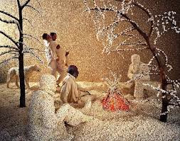
Sandy Skoglund is and American photographer and installation artist. She creates surrealist images by building exciting sets by adding and over whelming amount interesting objects which are sometimes bright and sometimes contrasting. 

These are my favorite images she has created: 
 I particularly like this one as it has a theme to it, winter. I think by almost everywhere being covered in white makes the red fire stand out and adds warmth to the photo. In addition to this I really like the yellow in the background as it makes the dark trees in the foreground almost look 3D.
I only really liked this photo because it had fish in it. I think it gives it a quirky feel to it because its hard to tell wether the fish are on land or are the humans in water? I think the colors really benefit each other and look well together. 


Contact sheets of my groups practice narrative photographs (digitally)


Here we took a series of photographs with six photos in each story. Taking these photos was enjoyable and it was fun thinking of different stories to photograph. It was also quite interesting making sure that each story was taken in only 6 photos. All of the stories which I captured myself are simple and this was influenced by Duane Michals as I thought that his work was effective even thought it was simple and I wanted to try and make my photos like this. My main inspiration was contemporary and photojournalism as my photos are both modern and tell a story. 

 The ideas which we had  and photographed where, 
  • Climbing up a bench
  • Throwing leaves in the air
  • Walking up the stairs
  • Walking across some poles
  • Walking down different paths
  • Sitting in different ares
  • Moving a stick around 


Different types of photography

Abstract
This is abstract photograph. This is because you cannot actually tell what the subject matter is. It is just made up of lines, shapes and colours. 

Historical
This is a a historical photograph as it was taken in the past (1960's.) A historical photo captures a moment of time and shows how things looked and worked differently compared to how things are now. For example this magazine cover shows how women looked and dressed differently in the 60's. 

Contemporary
This a contemporary photograph as it captures and represents a modern day girl. A contemporary photograph shows how things are now in the modern day.

Photojournalism
This is an example of photojournalism as it is something that would probably be put into a news paper which visually shows what an article is about. 

Commercial 
This is commercial photography as it is a form of advertisement for a company or brand name.
Editorial
An editorial photograph is is a story, but not a news story. For example reality stories in magazines or celebrity interviews. 


Narrative photography: Black and white film processing

Black and white film processing
We used a film camera and processed the images in the dark room. 

The process which we went through is in my sketch book. 


This was a test to see how much light we needed to expose onto our photographs before developing them to make them at the correct brightness, which wasn't too light or too dark. 
In the end we decided expose the light for 15 seconds as 5 seconds made it too light and 20 seconds made it too dark. 

In our group we made a photographic print of one story each. 
Here is my story of the theme climbing up a tree.


I thought the whole project of narrative photograph was interesting and I also enjoyed myself working in groups. I am pleased with my final series of photos which is the story of me climbing up a tree and I think that they look like they have been taken many years ago. In addition to this they also remind me of the black and white story boards which I researched by Duane Michals. I didn't find anything in particular difficult and I found the process and experience of the film processing fun and I would consider doing it again with different themed images. 

Tuesday, 10 December 2013

Digitally reconstructing a painting

In graphics we was asked to chose a still life painting that had several objects in it, which we liked, to try and digitally interpritate on photoshop.

Painting I chose to recreate, by Georges Braques.

My digital version.

First of all I found images on the internet of each individual object in my chosen painting and also something to use for the background.
 

Then using the magic wand tool I selected the background from these images and deleted. Sometimes in was not possible to select all the background so I used the eraser tool to rub out some small parts. 
I knew that there was no background to an image as it shows as a checkered background on photoshop. 
Now that I had my chosen objects for the painting I need to edit each object to make it look as similar to the painting as possible. 
I firstly did the skull and took screen shots to show how I did it. 

For the skull I went into the filter gallery and chose the filter named Paint Daubs.
Then using the ordinary standard paint brush tool as well as some of the other brushes I painted around and onto different parts of the skull to make it look like the one in the painting by Braques. Finally I again went into the filters gallery and chose the Texturizer tool to give the texture of the skull like it is in the painting. 
I was really pleased with how my skull turned out and I also found it quite easy and next I went onto the cross. 
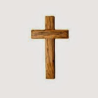
I opened the cross up in the filters gallery and again used the Paint Daubs filter. 
Then using another paint brush tool I added on the brown marks.
 Next I again used the Texturize tool in the filter gallery. 
The cross was again quite simple and easy to edit and it didn't take much time either. 
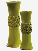
I then moved on to my final object of the green plant/vase.
This object was quite difficult to find on the internet and then also quite difficult to crop out its background. However I eventually did it and then edited it by using the Poster Edges filter. 
Next using a paint brush tool I painted on the yellow marks. (I'm not sure why the screen shot is in black and white.) 
Next using the I brought down the brightness and slightly increase the contrast.
Overall I found this object quite difficult to make in comparison to the other two as it was quite an unusual shape to reconstruct.

I opened up the original painting in photoshop and changed its size so that it would fit nicely onto an A4 page. Then one by one I added each object (including the back ground) on top of the original painting. 


Next using the paint brush I used varies colours and painted in the different paint marks and splatter around the objects and then merged all the layers together ti make it into one image. 


I am pleased with my overall image and apart from the green object I found reconstructing and edited the images quite easy and fairly fun. However I prefare creating my work by hand rather than on a computer as sometimes I get frustrated when I forget or can't do what I want.