Monday, 24 February 2014

Russian Constructivism

Russian Constructivism

Russian constructivism was a artistic and architectural movement with origins in Russia.
The key artists involved where:

  • Naum Gabo
  • El Lissitzky
  • Vladimir Mayakovsky
  • Alexander Rodchenko
  •  Varvara Stepanova
The idea was to make art more accessible for everyone by using everyday materials such as metal, glass, wood and cardboard along with the aim to create a Utopian society when the movement began just after World War 1. In addition to this they where inspired to explore the textural and spacial qualities when creating abstract structures.
The art included:

  • Architecture 
  • Graphic Design
  • Sculptures
  • Paintings- Although paintings where not as common as this media was seen more superior and therefore against the idea of an equal society. 
Graphic design in the movement varied from the packaging of products, posters, logos, the covers of books and forms of advertisement. The graphic design work by Rodchenko became an inspiration to many. 


This piece is by Rodchenko has certain features which make it a unique piece. For example, its use of only three colours and its font type and style. This makes the pieces simple yet effective as there isn't to much colour to distract or overly decorated text and therefore gets straight to the point. It also does this with the use of geometric shapes as well as being central and having a structured composition.


This is an abstract piece by Lissitzky and he has used both 3D and 2D shapes which he calls prouns. The 2D shapes are coloured which contradict with the toned 3D shapes and make the image look strange as it is difficult to understand where he has chosen to show where light is hitting the shapes and created the darker parts.


This artwork was created by Naum Gabo and was made with sheets of steel giving the object a brown/slightly red colour. I would say it is a figurative piece as it is very human like with human features. Naum has clearly thought how light will interact with the piece, as like a painting he has featured three tones, mid, light and dark. The work has similarities to cubism as it has been created by different shapes being assembled the way cubism does when breaking and reforming up a subject.

Sunday, 23 February 2014

Townscape Photography: Research and practical work

Photography research


Townscape
"The appearance of a town or city; an urban scene"

This is a historical photograph which was taken during the life time of Eugene Atget which was from 1857 until 1927. The time which it was taken makes it a historical image but also you can tell as it is in black and white and the buildings look old fashioned. I really like the photo because of its black and white as there is no color which can distract you from looking at the detail, such as the cobbles. In addition to this I like how the path narrows down into the distance and disappears. I would like to try and take an image similar to this for my townscape project.

This photo was taken by Henri Cartier-Bresson in Paris, 1932. I would say the date it was taken makes it a historical  photograph as it was taken over 70 years ago.  I like this photo because it is in black and white but in addition to this I really like the shadow which has been created in the puddle.  There is a contrast between the background and foreground as the foreground is much clearer and dominant compared to the misty building in the background.


This is a double exposed image by Harry Callahan. I really like the tow images which he put together as it looks quite strange, a car coming out of a wall. I'm not sure the time the images was created but Callahan's life ended in 1999 so his work is fairly modern. The foreground of the tree stands out to me and makes the car seem slightly set back. I think this is because of the texture of the wall which is on top of it.

centraalstrip

This double exposed image by Jay Archibald and is also a panorama. He states his approach to urban photography is less architectural and more an abstract neon behind glass and grate approach. I really liked a lot of his work and the two image below is my favorite out of them all.

timesadone1

timesadthree

I think these images have a lot of energy to it and I really like the bright colours and lights all merging together in them. I would say both of these are contemporary photos as they represents modern day night life.


This a contact sheet of some photographs I have taken of townscape scenes. I haven't had as much class time to take photos due to absence. I like quite a few of the photos which I have taken especially the ones on different angles. 


This is one of my favorite photos which I have taken. I like how the building looks quiet and abandoned. I think the graffiti and boarded up windows gives it a lonely atmosphere.
To improve the image I think it could have been taken at a slightly different angle and I think it would have looked better if the whole of the building, including the top, was showing.


I also liked this image I had taken and I chose to take it from the bottom of the back alley to try and get the same effect as Eugene Atget's photo which I analyzed further up.  However I don't like the green and red in the photo, I think its distracting and would look better in black and white, just like Atget's photo.
Using photoshop I made the photo black and white and adjusted the brightness and contrast. 
I prefer the photo much more now and I am pleased that it resembles Atget's work. 


Layers

Here, using photo shop, I have used two images and placed them on top of each other. Then I played about with the opacity until I had the right balance of each photo. Then I have used lots of different effects and also changed the brightness and contrast on some of the photographs.  I am really pleased with how these look , I also really like this effect which you can create using photo shop and will most probably use it again. These photographs are also in my visual note book. 

This is one of my favorite images and I think the building looks like a flag, with the lamppost holding it up. I especially like how the windows how been replaced with the brick wall showing through into the foreground.
This image is has much more character to it and I think the negative effect gives it a mysterious feel to it. Overall I am pleased with this image and it reminds me of Jay Archibald's work which I have researched above.
This one is one of my least favorite as you cannot see both of the photographs clearly unless you look closely. 
I am not overly pleased with this one either as the gate in the foreground makes the overall images look blurred.

I am pleased with the two images above as agin they also remind me of the images I liked by Jay Archibald.


Panoramas

A panoramic photo is simply any image which has two or more shots stitched together to make it appear as one large photograph.  Here are some examples of panorama's which I have found on the internet. ( http://photography.tutsplus.com/articles/40-inspiring-panoramic-photographs--photo-864 )
panoramic photography inspiration examples
I chose these three as examples which I really liked because of the sky in all of them. I thought the skies in the first two skies where pleasant to look at as they are clear and flawless. However my favorite is the sky setting the bottom example because of the colours fading together. It looks calm and peaceful. 
These are two panoramas which I have created on photoshop using some photographs I have taken around college. 
I am pleased with how the photos have fitted together in this one, how ever because of the rain I am disappointed with the quality of the image. 

I prefer this one much better as parts of the images are really clear and although some are not I actually really like how the clearness changes though out the image. This wasn't done intentionally. 


Double Exposure

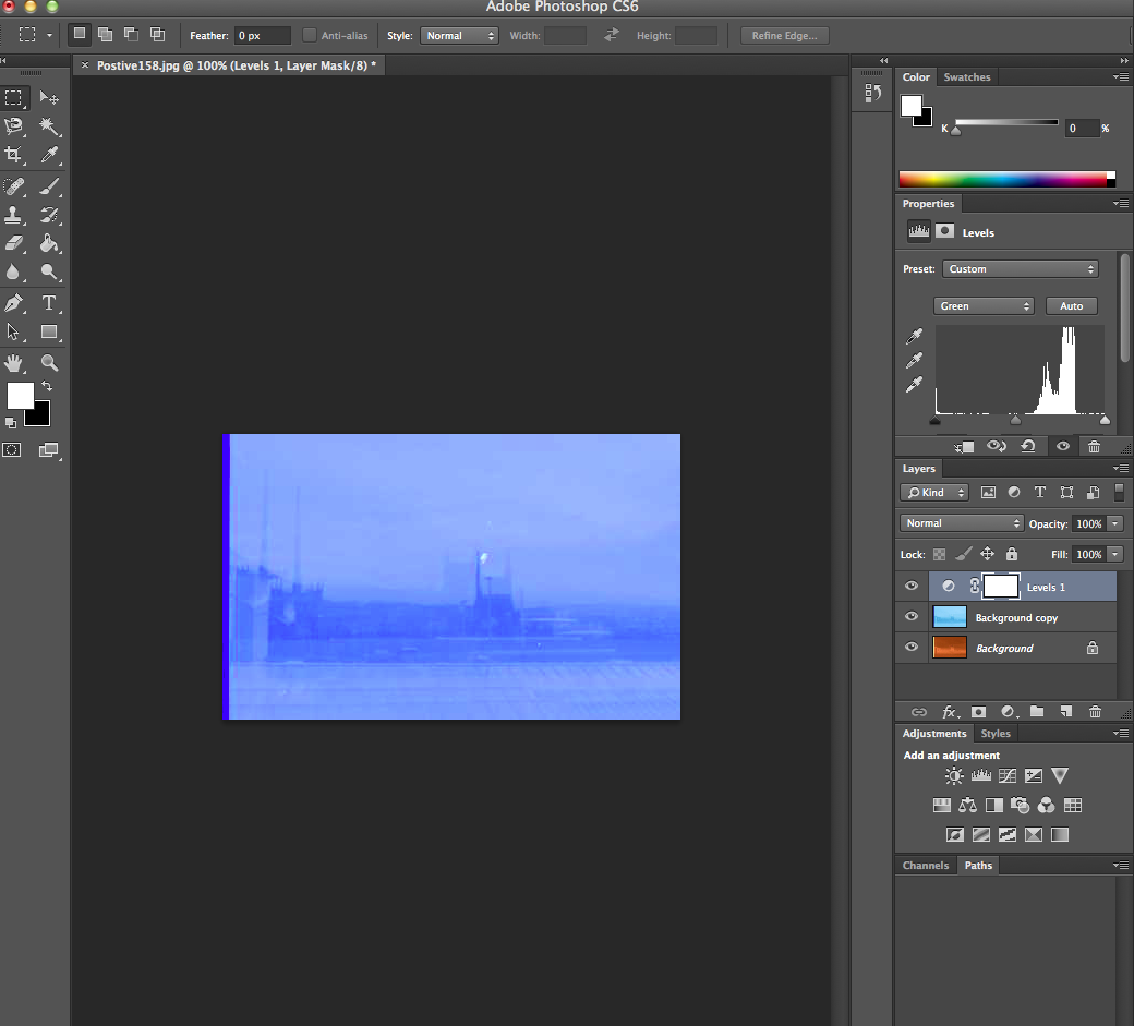
These images where taken with a film camera. They are double exposed, so there are two or more images on each film. They where developed at college by the technician an then scanned onto the macs. I then opened them up in photoshop and after duplicating the layer I went into Image, Adjustments and Invert. I then played around with the colour levels until I was pleased with the image. 
This process was a good chance to try out new skills with the film cameras and also photoshop. However I prefer using a digital camera and taking single images. 
This one was quite difficult to edit as the image in the background wasn't as clear as the foreground and I don't really like it. 


I really like this one because all parts of the image are visible. I like the original one above much more than the blue underneath because of its colour, it reminds me of a sepia edit. 


This edit is my favorite out of the four. I especially like the yellow background as it reminds me of the sun and I think is contrast really well with the dark buildings in the foreground.


I am also quite pleased with this edit. My favorite part is the different shades of blue. The image looks calming and quiet and reminds me of something out of a film. 


Wednesday, 19 February 2014

Illustrator

Exploring Shapes, Fill and Stroke
Here I have used the selection tool and also the direct selection tool which allows you to move certain parts of a shape you have created. Whereas the ordinary selection tool lets you move the whole shape and also alter its size. I have used the pen tool to make my straight edged and also curved shapes. To make a straight edge shape you simply click around where you want the sides to be and to close the shape you click where you first started. To create the curved shapes you click again use the pen however you click and drag which creates a curved like and you again click where you started to close the shape.
I have also experimented with the Fill and Stroke tool which lets you change the colour of the shape, its outline and also the thickness of the outline.
I found this task fairly easy once I got used to creating a curve with the pen tool.


Using the shape tool
Here I have used the shape tool.

The pink and green shapes on  the first row where created by choosing the shapes I wanted and then holding down the shift key whilst putting the shape onto the page. The shift key makes the shape perfect, for example holding the shift key when using the rectangle tool makes the said the same length so it is a perfect square.
The pink and yellow shapes on the second row where created using the pen tool, the way I did in the screenshot above.
Finally the red and blue shapes on the bottom row where created using the dialogue box. This allows you to change the dimension and also how many sides to the shape you want.

Brush strokes
Here I have experimented with some different artist brush tools and also altered the colours and size of stroke.
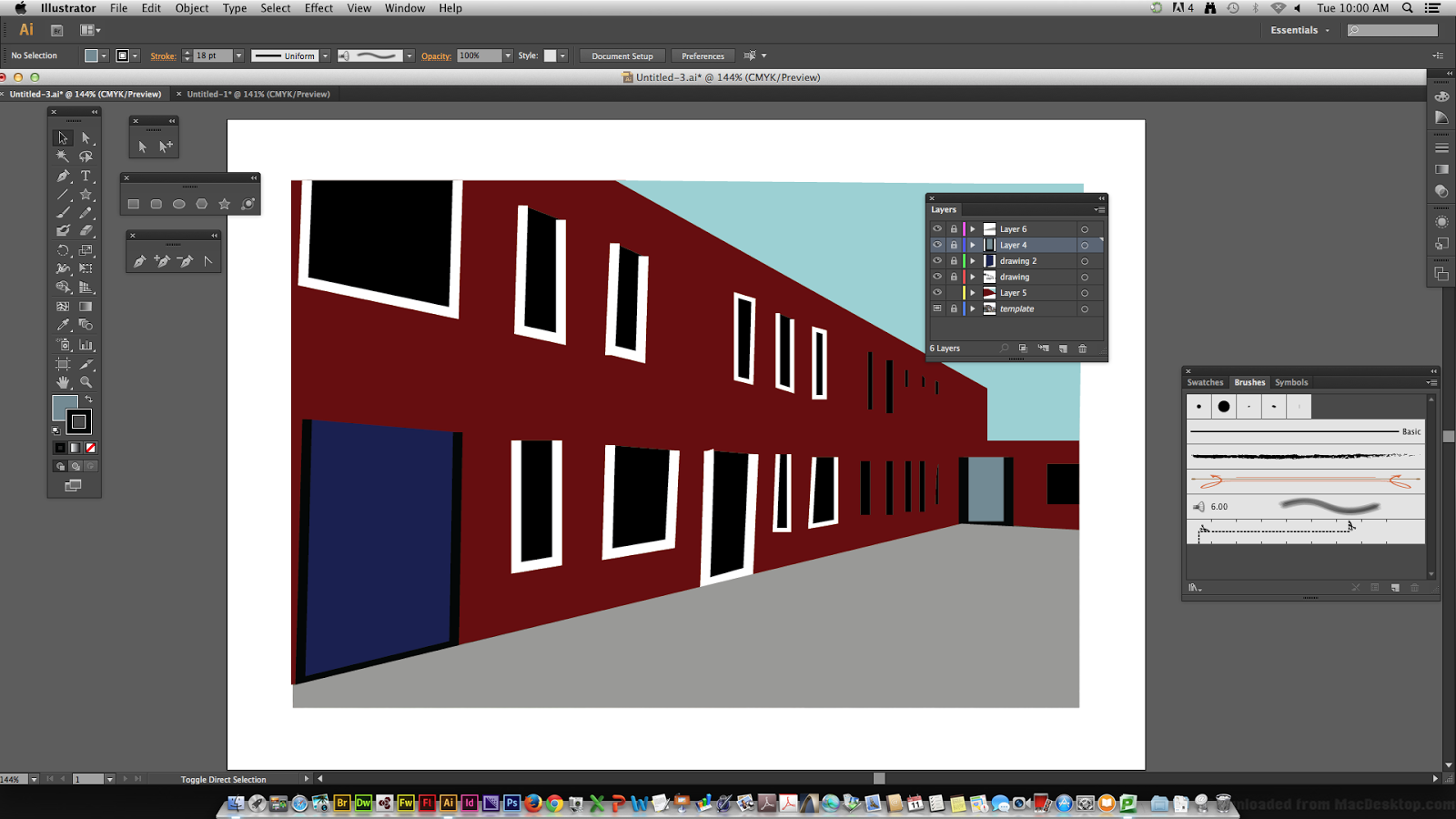

Here is a townscape image I have produced on illustrator using one of my photographs and the skills I have learnt on this software. I have done this by using different layers. My original layer was my photograph of a building, I then, using the different tools I built on top of the photograph with the pen tool and added colour. Every time I used a new colour for a different part of the building (e.g. a window) I created a new layer. 
I was pleased with how this image turned out and I fairly enjoyed the process of using Illustrator, although I found it difficult at first.
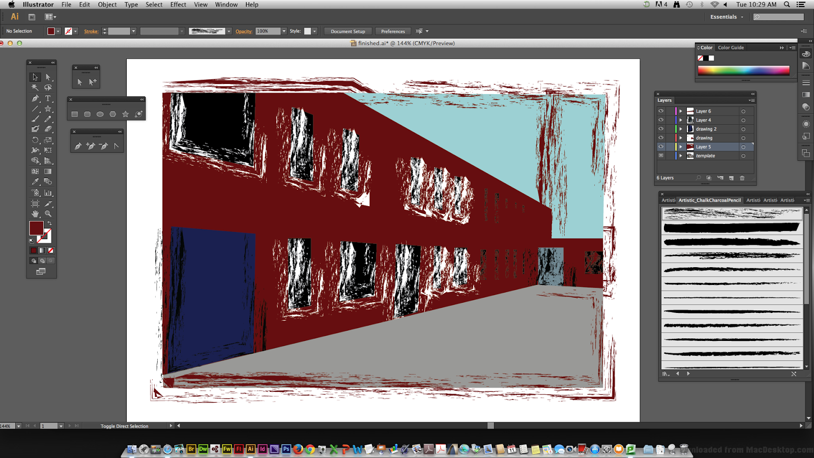
I saved my finished image and then using my knowledge with the artistic brush strokes, I added them onto my image. I much preferred the building like this as I think it gives it a a more interesting look. 
I have saved both of the images in my documents. 

Monday, 6 January 2014

Cubism

CUBISM

Cubism was the first form of abstract art and happened in the period of the early 20th century. The the key artist involved where Georges Braque and Pablo Picasso and a later participant was Juan Gris. The technique to cubism is the breaking up of a subject matter from all of its angles and then reassembling it in an abstract form. This makes the 3D subject become 2D. Pablo Picasso's painting, " Les Demoiselles d'Avignon" was considered to be the first cubist painting. The three main inspriations behind cubism are African sculptures, the Fauves and the artists Paul Cezanne and Georges Seurat.

The first type of cubism is known as Analytic cubism and was a significant art movement between 1908 and 1911 in France.  The style of this was having the different viewpoints of the subject in a geometrical framework with very little and subdued palette of colours. Here is an example. This is an oil painting by Geores Braque called "Violin and Jug" painted in 1910.
The second style of cubism was called Synthetic cubism and remained popular until 1919. This style was formed when Picasso began to glue printed images from the real world onto his still life work. He did this as cubism began to become predictable. Here is his painting "Still Life with Chair Caning" which opened a new door for himself and other artists for the second phase of cubism.

CUBIST PORTRAITS

This cubist portrait is by Picasso and was painting with oil onto canvas in 1910. It is called "Girl with a Mandolin and my favourite part is the background especially in the top right corner as it looks foggy/blurry. 

This cubist portrait was also by Picasso and was also created in 1910. It is again painted with oil and named "Portrait of Ambroise Vollard. I really like the dark colours and I think the expression of the face looks angry and gives a negative feel to the painting. 


Wednesday, 18 December 2013

Photograms

Photograms

photogram is a image created without a camera. It is done by by placing objects directly onto the surface of a light-sensitive material (such as photographic paper) and then exposing it to light. The areas of the paper that have received no light (where the objects have been) appear white and the ones which have been exposed to light appear grey/black once it has been through the developer (1 min), stop bath (1 min), fixer bath (1min), left in water to wash (2 mins) and then left to dry.
Here are my photograms which I made, which are in my sketch book. One of them are bleached which gives it the brown/yellow hint. 
I enjoyed working in the dark room and would like to do it again. 

Narrative Photography: Research and digital story board

Narrative Photography
Narrative photography is the idea that photographs can be used to tell a story.

PHOTOGRAPHER RESEARCH
I used the internet for my research sources. This is secondary research.

Duane Michals
Duane Michals is an American photographer who uses narrative photography. In his work of photo sequences he often adds texts to communicate emotion and philosophy. 
These are my favourite pieces of his work which I have seen:


 I think that this series of photographs makes a very beautiful picture as it seems to be telling the story of a young boys loved one going to heaven. I think by the story being told in only six photos is very effective and gives it a sense of peacefulness because it is so simple. The photograph is in black and white, making the young boy darker and the angel almost white. Whether this was done intentionally or not, white is a colour which usually represents purity and peace suggesting that in the story the person is much better off going to heaven, rather than staying on earth. 


In my opinion I think that Duane has created a very deep narrative photograph here. When I look at this series of images in the photo I instantly think that the story is tells us that the man is killing the flowers. This could possibly be seen as a metaphor of humans killing nature. By the photograph being in black and white it makes the image straight forward as there is no colour to create anything in particular stand out or any distractions. I really like this as it is a photograph because it look like it has meaning rather than just an image which has been taken for fun/pleasure.


Cindy Sherman
Cindy is an American photographer and film maker who is best known for her conceptual portraits. 
Rather than using several photos to tell a story, Cindy captures a story in one photograph.
Heres some examples of photos she has taken of herself which I liked,


I quite like Cindy's photographs as they are all action shots. As well as this each photograph makes you wonder what is going on. For example, why is she looking distressed? Why is she looking serious? Or why is she looking worried? I also like how the photos are in black and white because I feel this adds the mysterious atmosphere.  


Sandy Skoglund
Sandy Skoglund is and American photographer and installation artist. She creates surrealist images by building exciting sets by adding and over whelming amount interesting objects which are sometimes bright and sometimes contrasting. 

These are my favorite images she has created: 
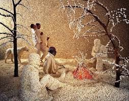
 I particularly like this one as it has a theme to it, winter. I think by almost everywhere being covered in white makes the red fire stand out and adds warmth to the photo. In addition to this I really like the yellow in the background as it makes the dark trees in the foreground almost look 3D.
I only really liked this photo because it had fish in it. I think it gives it a quirky feel to it because its hard to tell wether the fish are on land or are the humans in water? I think the colors really benefit each other and look well together. 


Contact sheets of my groups practice narrative photographs (digitally)


Here we took a series of photographs with six photos in each story. Taking these photos was enjoyable and it was fun thinking of different stories to photograph. It was also quite interesting making sure that each story was taken in only 6 photos. All of the stories which I captured myself are simple and this was influenced by Duane Michals as I thought that his work was effective even thought it was simple and I wanted to try and make my photos like this. My main inspiration was contemporary and photojournalism as my photos are both modern and tell a story. 

 The ideas which we had  and photographed where, 
  • Climbing up a bench
  • Throwing leaves in the air
  • Walking up the stairs
  • Walking across some poles
  • Walking down different paths
  • Sitting in different ares
  • Moving a stick around 


Different types of photography

Abstract
This is abstract photograph. This is because you cannot actually tell what the subject matter is. It is just made up of lines, shapes and colours. 

Historical
This is a a historical photograph as it was taken in the past (1960's.) A historical photo captures a moment of time and shows how things looked and worked differently compared to how things are now. For example this magazine cover shows how women looked and dressed differently in the 60's. 

Contemporary
This a contemporary photograph as it captures and represents a modern day girl. A contemporary photograph shows how things are now in the modern day.

Photojournalism
This is an example of photojournalism as it is something that would probably be put into a news paper which visually shows what an article is about. 

Commercial 
This is commercial photography as it is a form of advertisement for a company or brand name.
Editorial
An editorial photograph is is a story, but not a news story. For example reality stories in magazines or celebrity interviews.